What do you think about the logo on the forum?
The forum software requires it to be a square.
Is having “MH LAW ONLINE” too much for the small space?
Any other ideas?
Thanks.
What do you think about the logo on the forum?
The forum software requires it to be a square.
Is having “MH LAW ONLINE” too much for the small space?
Any other ideas?
Thanks.
What do you think of these?
(1) Apparently this one wasn’t easy enough to read:

(2) No border so the writing can be a bit bigger (not much):

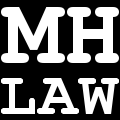
(3) Without “online”:

(4) As above but no border so bigger writing:
(5) Another possibility:

I like the simplist one so the bottom one or the one you’re using, with or without the border. It reminds me of another logo I have seen recently but can’t quite place.
Thanks. I wonder what it is. My first attempt was an M in a circle, until I realised I had re-created the Morrisons logo.
Great site Jonathan! Every logo looks somewhat like some other logo, but to my eye the last is definitely the clearest…
No. 5 Looks good to met
I like to MHLO one - simple and classy!
I forgot to reply to say thank you for your thoughts - thank you! I went for number 5 in the end.